In the era of big data, dashboards have become essential tools for businesses to visualize information and make informed decisions. However, many organizations find that their dashboards fail to deliver the expected return on investment (ROI). This blog post will explore three common issues associated with poorly designed dashboards and offer solutions to transform them into effective decision-making tools.
Introduction
Imagine a company that has access to vast amounts of data but struggles to leverage it effectively. Despite utilizing popular tools like PowerBI and Tableau, their dashboards are cluttered, poorly designed, and fail to communicate insights clearly. This lack of effective data visualization can lead to misguided decisions, a problem faced by many organizations today. The aesthetics of dashboards—such as charm, color use, typeface, and flow—are not mere design choices; they are essential for meaningful data communication. In this post, we will delve into three reasons why your dashboards may not be delivering ROI and how to address these challenges.
1. Lack of Clear Purpose and Audience Focus

One of the primary reasons dashboards fail is the absence of a clear purpose and focus on the intended audience. Without understanding the specific decisions that hinge on the dashboard or the story that the data should tell, it becomes challenging to create a tool that delivers value.
To overcome this issue, organizations should:
- Identify Business Goals: Start by understanding what the business really needs from the dashboard. Determine which decisions depend on these insights and define the key performance indicators (KPIs) that matter most.
- Engage Stakeholders: Collaborate with various departments to gather insights into their specific needs and pain points regarding current dashboards. This phase is about tuning into diverse requirements.
- Prioritize Critical Metrics: Focus on the most important metrics that drive decision-making, ensuring that the dashboard provides actionable insights.
By aligning dashboards with clear objectives and user requirements, organizations can ensure they deliver real value and ROI.
2. Poor Visual Design and Data Presentation

Another common issue is ineffective visual design. Dashboards that are cluttered, use mismatched colors, or have a non-intuitive flow can confuse users and obscure critical insights.
To enhance visual design, consider implementing best practices:
- Key Design Elements: Focus on integrity (accurate data), flow (narrative structure), color (highlighting important information), typeface (readability), and charm (engaging aesthetics).
- User-Centric Design: Create dashboards that are visually appealing yet user-friendly. Choose appropriate visual elements that effectively communicate the data story.
- Visual Clarity: Ensure every component serves a purpose, enhancing overall data storytelling while maintaining clarity and readability.
By emphasizing design excellence, organizations can create dashboards that not only look good but also effectively convey critical information at a glance.
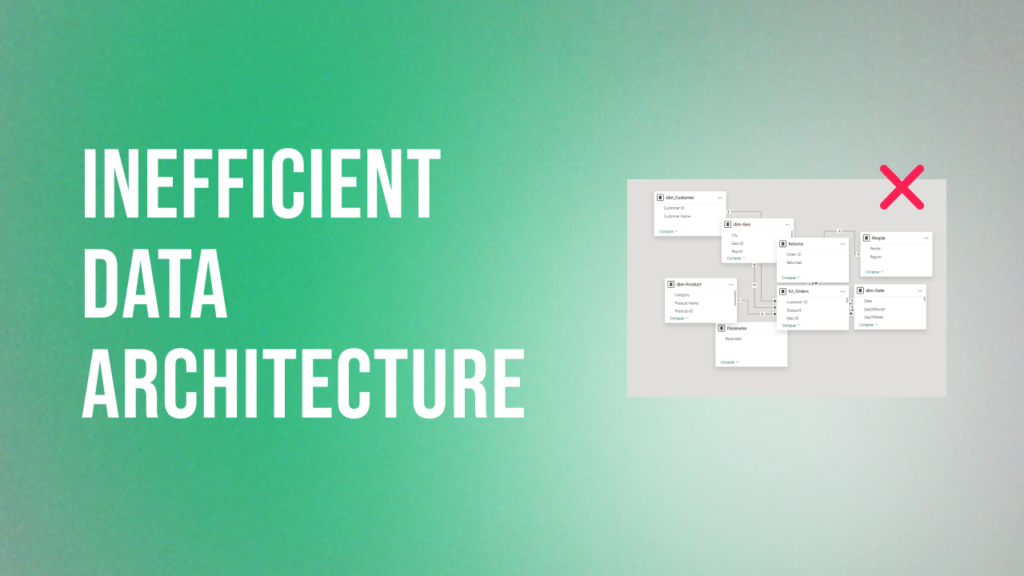
3. Inefficient Data Architecture and Processing

Poorly structured data models and inefficient ETL (Extract, Transform, Load) processes can lead to slow or inaccurate dashboards. This inefficiency can severely impact decision-making capabilities.
To address these challenges:
- Implement Optimized Data Models: Use structured models like star schemas to enhance query efficiency and clarity.
- Streamline ETL Processes: Ensure accurate extraction, transformation, and loading of data into dashboard-friendly formats.
- Leverage Automation: Automate ETL processes to reduce manual errors and improve efficiency.
By prioritizing efficient data architecture and processing, organizations can create high-performing dashboards that deliver timely insights.
Conclusion
The effectiveness of dashboards goes beyond mere aesthetics; it hinges on clear purpose, thoughtful design, and efficient data architecture. By addressing these common issues—lack of clarity in purpose, poor visual design, and inefficient data processing—organizations can unlock the full potential of their dashboards. Embracing these strategies ensures that your dashboards not only look good but also deliver actionable insights that propel your business forward. In a world where data is integral to decision-making, investing in effective dashboard design is not just beneficial; it’s essential for achieving lasting ROI.


